Interesting international comparisons about Covid-19 Financial Times has a page with a nice way to read international comparisons regarding the changes in the spread of the virus. It is important to understand what figures they show in those international comparisons. They use the average number of deaths over the last 7 days. As day zero […]
Lees volledig artikel: Interesting international comparisons about Covid-19
Interesting international comparisons about Covid-19
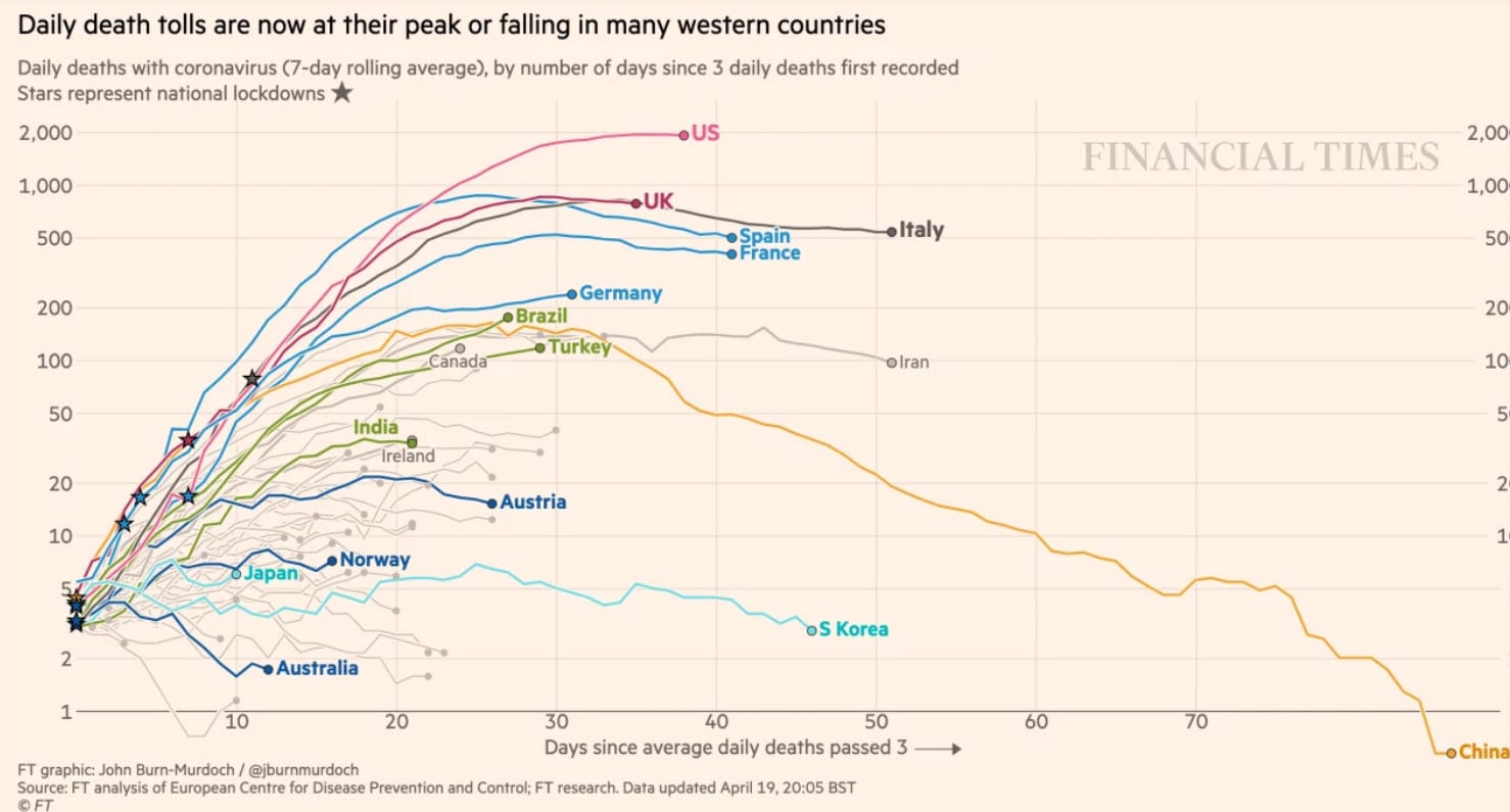
Financial Times has a page with a nice way to read international comparisons regarding the changes in the spread of the virus.
It is important to understand what figures they show in those international comparisons.
- They use the average number of deaths over the last 7 days.
- As day zero for their graph, they use the first day with 3 deaths on average in that country/region,
- The graph display is logarithmic. This is the usual way of showing the development of the spread of a virus.
- The star indicates when a country went into Lock down.
Reproduction factor
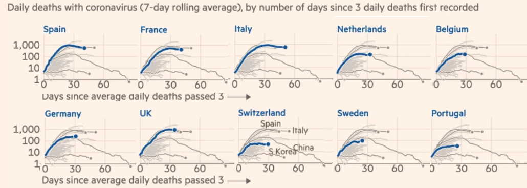
Although the countries vary greatly in size -and most other statistics use the number of deaths per million inhabitants- this approach shows how the reproduction factor develops in that country. If the lines would not turn to the right, the virus would continue to spread unrestrainedly.
It is important to realize as well, that in smaller countries it takes longer to exceed the limit of 3 deaths per day, which may mean that measures are already in place before that country reaches that amount per day. In much larger countries the 3 deaths per day are reached quickly and therefore measures were usually not introduced until later.
From the charts that are alphabetically listed per country on the website, I have made a selection. And I rearranged them a bit differently.
Fast increase
Spain, France, Italy and England show the fastest increase up to and including the 25th day. In the other countries, including the Netherlands, we see a deflection sooner. Sweden is a special case, because they have taken few measures, and I’ll go into that in another blog.
We see that the US has the steepest increase of all countries, including Western Europe. I myself am rather charmed by the alertness of the Czech response. Here you can read what happened there. From the 18th of March it is mandatory to wear mouth protection outdoors in that country. Since April 12th this is also the case in Israel.
With regard to the warmer and more humid countries, I think their curve is positively influenced because the weather has contributed to a slower spread than in the colder and less humid Western Europe and New York.
Asian countries
Finally, above we see the four Asian countries that immediately started to wear mouth protection en masse. There are many indications that as a result, people are less likely to infect other people. The number of deaths per million inhabitants is currently more than 100 times smaller in these countries than in Western Europe. So Japan with 100 million inhabitants has fewer deaths in total than France, Spain or Italy now have every day.
A number of countries are not listed (such as Singapore and Taiwan). That’s because they have not realized 3 deaths a day yet. In case they would be listed, the line goes straight down.
So these figures are on country level. But I also have the figures per region in Italy. And then it’s interesting to see that there are big differences there as well. At the beginning of March they had already taken restrictive measures in Lombardy. On 9 March all over Italy. When looking at the graphs per province it should be kept in mind that day 1 per province was sometimes well before the start of those measures and in other regions even after the start of those measures.
Below you can see the regions in Italy.
The top four lines are regions in the North of the country. You can choose regions yourself and then only view that curve.
We did the same for the Dutch provinces.
The problem with the Dutch figures compared to those in other countries is that the RIVM does not register the provinces’ casualties per day that they announce that figure, but per date that the persons actually died, which implies that the figures may change for another week.
The curve seems to flatten out a bit more than in other countries. But that is also related to something else. Since a week, doctors try to register better, so we see an increase in death toll numbers, but that increase doesn’t seem to be accurate, because hospital admissions and the influx to the ICU’s is decreasing. While around 27 March the number of hospital admissions per day was around 500, it is now just over 100.
Here too, we see a pattern like in Italy, where the regions in the North of the country have a much more steeper line than in the rest of the country. Here we see that North Brabant developed steeper than the other provinces.
Important factors
As I have often said (and this is also the case in the US, where I am still working on a similar chart), I think the most important factors are differences in distribution patterns between regions and countries:
- Whether or not there have been major super spread events
- The level of humidity in the air which has caused the spread of the virus to be faster or slower. (And in countries with very high humidity and the vast majority of people living in houses without windows, the rate of spread will approach zero).
- The government measures. (And as for the latter, there are many indications that wearing mouth covers has a greater effect on slowing the spread than the 1.5 meter rule).
Personally, I think the first factor has been the most important in the major outbreaks we’ve seen. Now that these kind of gatherings are on hold worldwide, we see a clear flattening of the growth everywhere.
In countries south of the 20th parallel North we see relatively low numbers of infected people and generally flatter growth curves.
And in countries where mouth protection is worn, the number of deaths per inhabitant remains a factor of 100 or more times lower than in Western Europe and New York.
Not dramatic at all
In the coming weeks we will see almost everywhere, that measures are being weakened. And we will see what happens then. I wouldn’t be surprised if we don’t see many new major outbreaks. But let’s agree that if there are any new increases in cases anywhere in the world, we’ll thoroughly analyze what’s going on and what the extent is. The past few weeks I’ve seen too much (also in statements by virologists on television) of claiming that there was a huge new outbreak, where a simple analysis showed that the extent of what was happening was not that dramatic at all
Especially in this day and age it would be important when it comes to the numbers of infected persons, hospitalizations, deaths, etc. that everyone sticks to the facts. And if you want to factcheck any for yourself, I advise you to just Google on “wikipedia, Covid-19” followed by the name of the country you want to know more about. And you will get a wealth of material.
You have just read: Interesting international comparisons about Covid-19.


